ArcoBEAT: Designed for Constrained Hardware in the Field
Overview
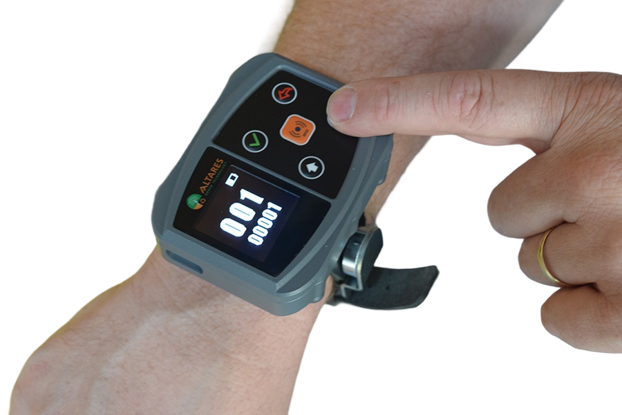
ArcoBEAT is a handheld device used by waste collection crews to track bins, routes and service quality directly from the truck. The original interface made core tasks slow and error‑prone, especially when operators were under time pressure or working in difficult conditions.
Challenge
Design a way for operators to quickly capture and report a wide range of route issues, such as damaged bins, overflow and misplaced waste, without interrupting their main collection flow.
The solution had to work within ArcoBEAT’s constrained hardware, including a small monochrome screen and five physical buttons, support 28 distinct problem types, and remain legible and low effort for operators working outdoors with gloves, variable light and significant time pressure.
My Role
As part of a multidisciplinary student team, I contributed to the UX redesign of ArcoBEAT’s core workflows and screen layouts, focusing on making interactions simpler, clearer and more reliable in the field. Our work was structured as a design sprint, from understanding the current process through to prototyping and user testing.
- Team: 4 design students (UX, visual, product)
- My role: UX designer and interaction designer
- Responsibilities: mapping current workflow, defining key user scenarios, designing screen flows, building interactive prototype, supporting user testing.
Final Design
ArcoBEAT’s interface now focuses on a single, clear route view and an equally clear entry point for reporting issues. The main screen shows current bin, route progress and key status in large, high‑contrast elements, optimized for the small monochrome display and five physical buttons. Operators can trigger a dedicated “Report issue” flow from the main path, where the 28 problem types are grouped into a few simple categories and navigated with consistent button mappings, making the device usable with gloves and under time pressure.
The interactive prototype is available here.
Design Process
We approached the challenge with a one‑week design sprint:starting from a broad brief and ending with a tested prototype.
Map The Problem
First, we mapped the existing ArcoBEAT workflow and the new requirement to report issues within the pay‑as‑you‑throw model. This led to a consolidated flow chart that shows where operators scan bins, where problems arise, and where the device needs to support branching into issue reporting.
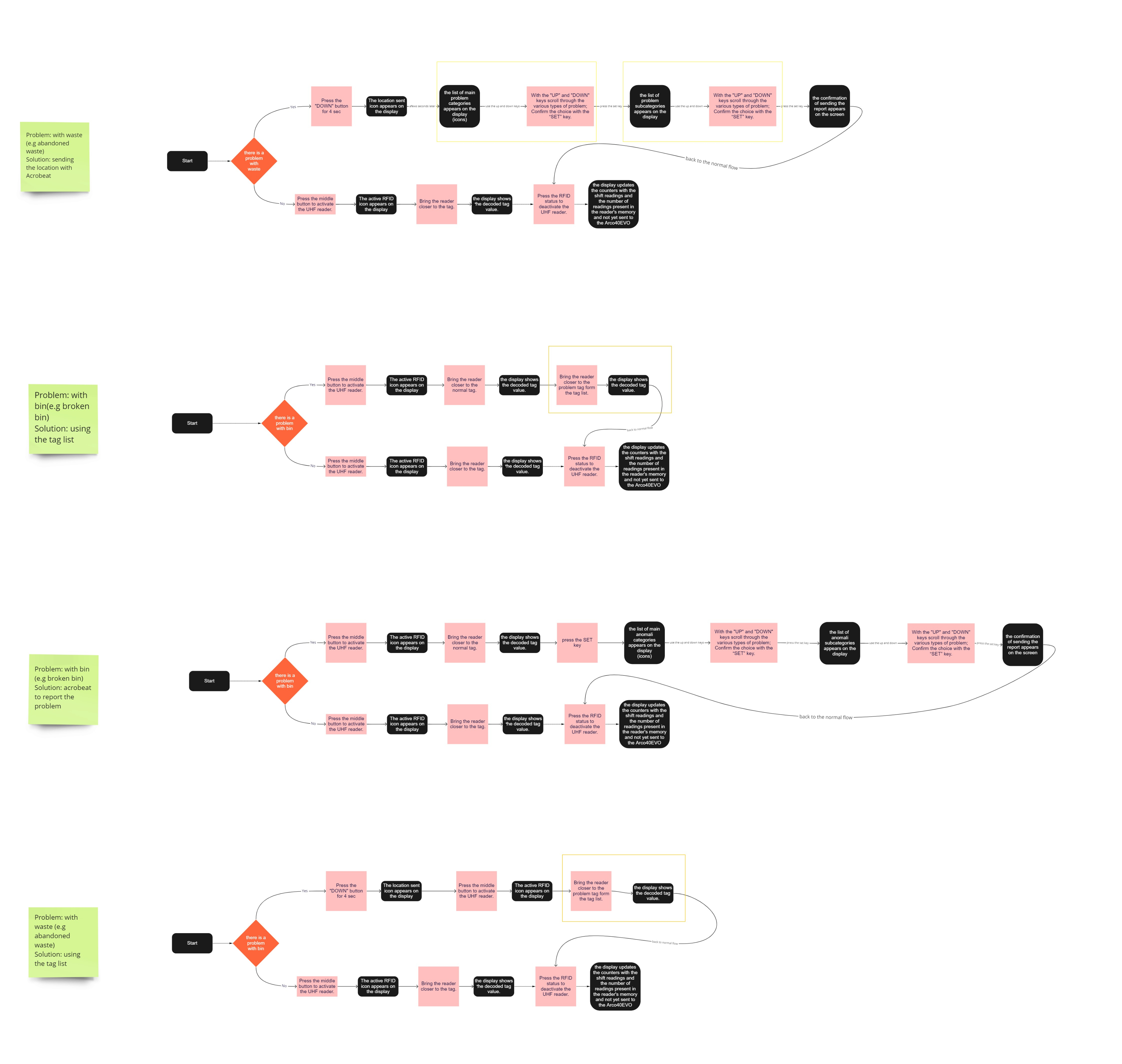
User flows to map the problem
Ideation
In ideation, each team member sketched alternative flows, which we then consolidated into two distinct solution directions. We captured this concept in an animated videos
The first direction keeps all interactions on the device: issues are grouped into a small set of categories, navigated with the five physical buttons and displayed using icons and short labels that fit the monochrome screen.
The second direction offloads complexity into the physical environment. A metal card mounted on the truck lists all problem types, each with an associated tag; when an issue occurs, the operator scans the corresponding tag with ArcoBEAT instead of navigating a long list on the device.
Animated video of the first solution
Animated video of the second solution
Prototype
We then built a clickable mockup of the on‑device concept in Figma, focusing on button mappings, information hierarchy and feedback states on the small screen.
The interactive prototype is available here, and shows the main route view, the entry into “Report issue,” the categorized problem list and the confirmation screens in one coherent flow.
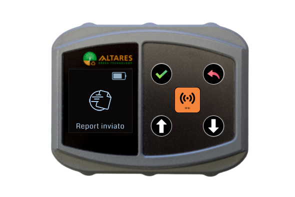
“Report sent” feedback at the end of the flow
User testing
We tested both ideas with users, after an early discussion with Sartori Ambiente’s technical lead to validate assumptions. Participants consistently preferred the on‑device solution, finding the icon‑based categories faster and easier to understand, while the physical card raised concerns about walking back to the truck, handling scanning errors and readability at night. Based on these insights, we refined the on‑device flow and button logic, and recommended further in‑context trials for the physical card as a potential complementary solution rather than the primary one.
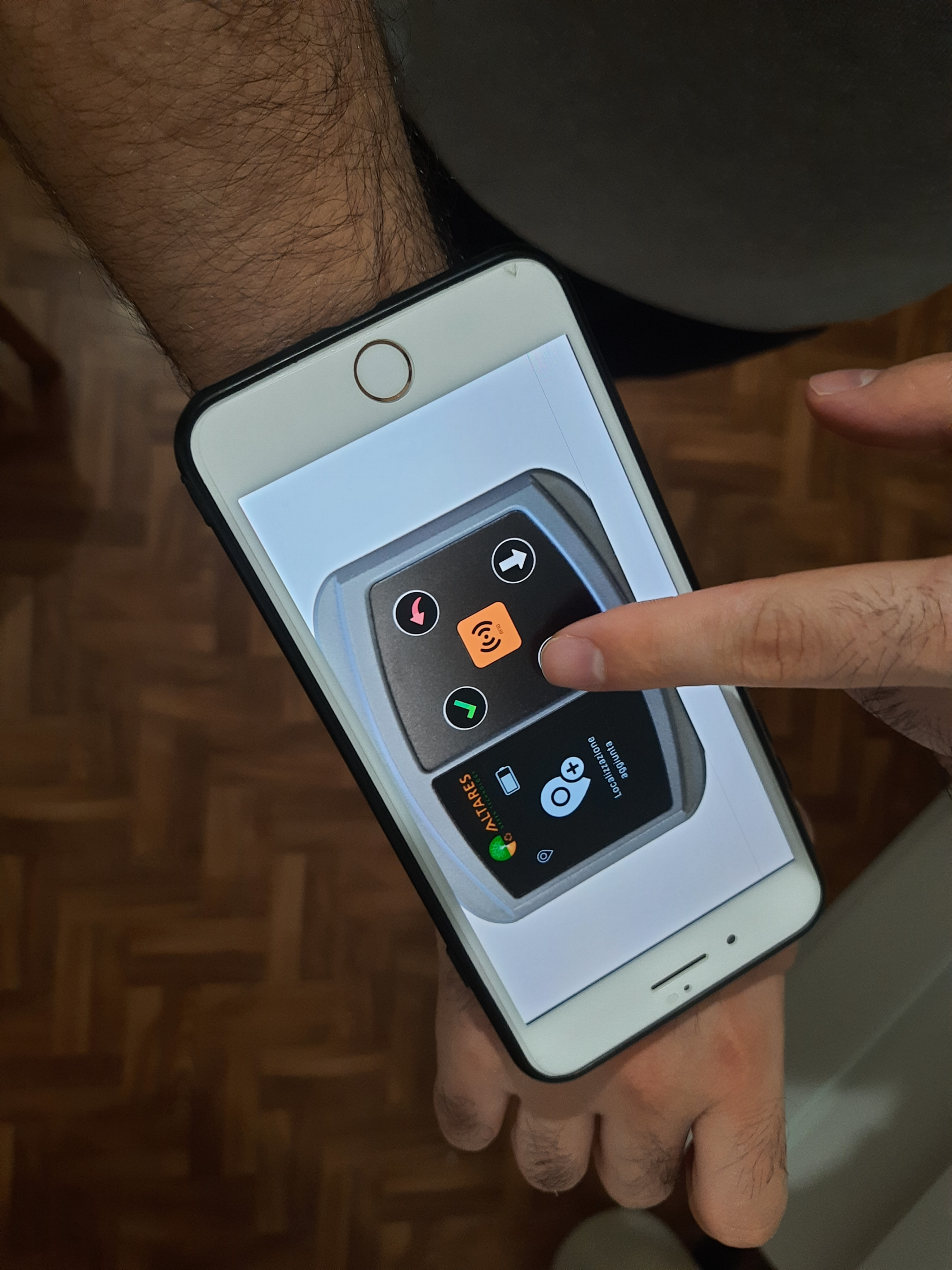
We had testers wear their phones on their wrists to simulate using the actual band.
My Reflection
This project was a good exercise in treating hardware constraints as a design material rather than a limitation. Working with a tiny monochrome screen and five physical buttons forced us to be very disciplined about hierarchy, flows and states, and to make every interaction feel intentional for operators who are working outdoors and under time pressure.
It also highlighted how important it is to explore both on‑device and physical solutions when the interface is embedded in a real environment. Even though the physical tag card was not the preferred option in our tests, it surfaced valuable questions about how far operators move from the truck and how lighting conditions affect usability.
If I were to take this further, I would spend more time testing in real route conditions with actual operators, validating how well the on‑device flow holds up across longer shifts and whether a simplified physical aid could still complement the interface in specific scenarios.
ArcoBEAT: Designed for Constrained Hardware in the Field
Overview
ArcoBEAT is a handheld device used by waste collection crews to track bins, routes and service quality directly from the truck. The original interface made core tasks slow and error‑prone, especially when operators were under time pressure or working in difficult conditions.
Challenge
Design a way for operators to quickly capture and report a wide range of route issues, such as damaged bins, overflow and misplaced waste, without interrupting their main collection flow.
The solution had to work within ArcoBEAT’s constrained hardware, including a small monochrome screen and five physical buttons, support 28 distinct problem types, and remain legible and low effort for operators working outdoors with gloves, variable light and significant time pressure.
My Role
As part of a multidisciplinary student team, I contributed to the UX redesign of ArcoBEAT’s core workflows and screen layouts, focusing on making interactions simpler, clearer and more reliable in the field. Our work was structured as a design sprint, from understanding the current process through to prototyping and user testing.
- Team: 4 design students (UX, visual, product)
- My role: UX designer and interaction designer
- Responsibilities: mapping current workflow, defining key user scenarios, designing screen flows, building interactive prototype, supporting user testing.
Final Design
ArcoBEAT’s interface now focuses on a single, clear route view and an equally clear entry point for reporting issues. The main screen shows current bin, route progress and key status in large, high‑contrast elements, optimized for the small monochrome display and five physical buttons. Operators can trigger a dedicated “Report issue” flow from the main path, where the 28 problem types are grouped into a few simple categories and navigated with consistent button mappings, making the device usable with gloves and under time pressure.
The interactive prototype is available here.
Design Process
We approached the challenge with a one‑week design sprint:starting from a broad brief and ending with a tested prototype.
Map The Problem
First, we mapped the existing ArcoBEAT workflow and the new requirement to report issues within the pay‑as‑you‑throw model. This led to a consolidated flow chart that shows where operators scan bins, where problems arise, and where the device needs to support branching into issue reporting.
User flows to map the problem
Ideation
In ideation, each team member sketched alternative flows, which we then consolidated into two distinct solution directions. We captured this concept in an animated videos
The first direction keeps all interactions on the device: issues are grouped into a small set of categories, navigated with the five physical buttons and displayed using icons and short labels that fit the monochrome screen.
The second direction offloads complexity into the physical environment. A metal card mounted on the truck lists all problem types, each with an associated tag; when an issue occurs, the operator scans the corresponding tag with ArcoBEAT instead of navigating a long list on the device.
Animated video of the first solution
Animated video of the second solution
Prototype
We then built a clickable mockup of the on‑device concept in Figma, focusing on button mappings, information hierarchy and feedback states on the small screen.
The interactive prototype is available here, and shows the main route view, the entry into “Report issue,” the categorized problem list and the confirmation screens in one coherent flow.
“Report sent” feedback at the end of the flow
User testing
We tested both ideas with users, after an early discussion with Sartori Ambiente’s technical lead to validate assumptions. Participants consistently preferred the on‑device solution, finding the icon‑based categories faster and easier to understand, while the physical card raised concerns about walking back to the truck, handling scanning errors and readability at night. Based on these insights, we refined the on‑device flow and button logic, and recommended further in‑context trials for the physical card as a potential complementary solution rather than the primary one.
We had testers wear their phones on their wrists to simulate using the actual band.
My Reflection
This project was a good exercise in treating hardware constraints as a design material rather than a limitation. Working with a tiny monochrome screen and five physical buttons forced us to be very disciplined about hierarchy, flows and states, and to make every interaction feel intentional for operators who are working outdoors and under time pressure.
It also highlighted how important it is to explore both on‑device and physical solutions when the interface is embedded in a real environment. Even though the physical tag card was not the preferred option in our tests, it surfaced valuable questions about how far operators move from the truck and how lighting conditions affect usability.
If I were to take this further, I would spend more time testing in real route conditions with actual operators, validating how well the on‑device flow holds up across longer shifts and whether a simplified physical aid could still complement the interface in specific scenarios.
ArcoBEAT: Designed for Constrained Hardware in the Field
Overview
ArcoBEAT is a handheld device used by waste collection crews to track bins, routes and service quality directly from the truck. The original interface made core tasks slow and error‑prone, especially when operators were under time pressure or working in difficult conditions.
Challenge
Design a way for operators to quickly capture and report a wide range of route issues, such as damaged bins, overflow and misplaced waste, without interrupting their main collection flow.
The solution had to work within ArcoBEAT’s constrained hardware, including a small monochrome screen and five physical buttons, support 28 distinct problem types, and remain legible and low effort for operators working outdoors with gloves, variable light and significant time pressure.
My Role
As part of a multidisciplinary student team, I contributed to the UX redesign of ArcoBEAT’s core workflows and screen layouts, focusing on making interactions simpler, clearer and more reliable in the field. Our work was structured as a design sprint, from understanding the current process through to prototyping and user testing.
- Team: 4 design students (UX, visual, product)
- My role: UX designer and interaction designer
- Responsibilities: mapping current workflow, defining key user scenarios, designing screen flows, building interactive prototype, supporting user testing.
Final Design
ArcoBEAT’s interface now focuses on a single, clear route view and an equally clear entry point for reporting issues. The main screen shows current bin, route progress and key status in large, high‑contrast elements, optimized for the small monochrome display and five physical buttons. Operators can trigger a dedicated “Report issue” flow from the main path, where the 28 problem types are grouped into a few simple categories and navigated with consistent button mappings, making the device usable with gloves and under time pressure.
The interactive prototype is available here.
Design Process
We approached the challenge with a one‑week design sprint:starting from a broad brief and ending with a tested prototype.
Map The Problem
First, we mapped the existing ArcoBEAT workflow and the new requirement to report issues within the pay‑as‑you‑throw model. This led to a consolidated flow chart that shows where operators scan bins, where problems arise, and where the device needs to support branching into issue reporting.
User flows to map the problem
Ideation
In ideation, each team member sketched alternative flows, which we then consolidated into two distinct solution directions. We captured this concept in an animated videos
The first direction keeps all interactions on the device: issues are grouped into a small set of categories, navigated with the five physical buttons and displayed using icons and short labels that fit the monochrome screen.
The second direction offloads complexity into the physical environment. A metal card mounted on the truck lists all problem types, each with an associated tag; when an issue occurs, the operator scans the corresponding tag with ArcoBEAT instead of navigating a long list on the device.
Animated video of the first solution
Animated video of the second solution
Prototype
We then built a clickable mockup of the on‑device concept in Figma, focusing on button mappings, information hierarchy and feedback states on the small screen.
The interactive prototype is available here, and shows the main route view, the entry into “Report issue,” the categorized problem list and the confirmation screens in one coherent flow.
“Report sent” feedback at the end of the flow
User testing
We tested both ideas with users, after an early discussion with Sartori Ambiente’s technical lead to validate assumptions. Participants consistently preferred the on‑device solution, finding the icon‑based categories faster and easier to understand, while the physical card raised concerns about walking back to the truck, handling scanning errors and readability at night. Based on these insights, we refined the on‑device flow and button logic, and recommended further in‑context trials for the physical card as a potential complementary solution rather than the primary one.
We had testers wear their phones on their wrists to simulate using the actual band.
My Reflection
This project was a good exercise in treating hardware constraints as a design material rather than a limitation. Working with a tiny monochrome screen and five physical buttons forced us to be very disciplined about hierarchy, flows and states, and to make every interaction feel intentional for operators who are working outdoors and under time pressure.
It also highlighted how important it is to explore both on‑device and physical solutions when the interface is embedded in a real environment. Even though the physical tag card was not the preferred option in our tests, it surfaced valuable questions about how far operators move from the truck and how lighting conditions affect usability.
If I were to take this further, I would spend more time testing in real route conditions with actual operators, validating how well the on‑device flow holds up across longer shifts and whether a simplified physical aid could still complement the interface in specific scenarios.